Business Tip: We’re Testing a New Email Template
Interested in Adobe Creative Suite? This is a weekly newsletter for creative professionals who use Macs (but Windows users are welcome too). If you're new here, you may want to subscribe via RSS or Email or Twitter for a mix of new tips each week. Thanks for visiting!
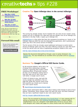
Our email tip subscribers will notice the look of our email newsletter changed a lot this week. We’re trying out a new 2-column format, as well as testing a switch over to MailChimp for our email delivery service.
This is the 228th straight week of publishing our weekly tips newsletter, and this is the first time we’ve tested significant changes in our template.
Please bear with us while we work out some of the details. I’d love to hear your feedback and questions in the comments on this post.


December 1st, 2008 at 6:17 am
Feedback on your new template:
I like it, but would prefer that the small column with webinar data show up on the right hand side rather than the left, similar to the design of your ‘full tip’ pages. I’d like to read the tip first, then look at the rest. As the design is now, it’s a bit annoying to have to look past the webinar column to get to the tip.
Thanks for the site and your great tips!
Susan
December 1st, 2008 at 6:18 am
Hi Craig — The new format works great. Came in to Apple Mail just fine, and I found the content easy/quick to browse. You and your team are amazingly excellent. — Kevin
December 1st, 2008 at 6:19 am
Hi,
Im probably going to be one of those annoying people with a very daft and small comment!
I use a plugin so my mail is vertical, which means it cuts off the right hand side of the e-mail out (unless you scroll obviously or have columns a different size..)if you change the order of the columns so people (if they have it set up like me) would see your glorious tips first??
here a screen shot if you interested..
http://rustyandhamishproductions.com/creativetechs/Picture.png
if not, just ignore me but thank you for such a great set of tip all the time!
p.s have you ever looked at streamsend for mail out there very very good….http://www.streamsend.com/
December 1st, 2008 at 6:42 am
I like it!!
December 1st, 2008 at 6:53 am
Thanks for all the feedback so far.
Susan, James, I hear what you are saying about the column on the left side. Thanks for the screenshot James! (By the way, James, is that Letterbox you are using to add a vertical preview to Mail? I’ve been debating writing that up as a tip.)
Kevin, Thank you for you kind words! It helps keep us going.
December 1st, 2008 at 7:03 am
Love the new look. keep up the good work. jr
December 1st, 2008 at 7:06 am
Hi Craig,
Yes it is, thought I’d try it out as i use MBP 17″ and Cinema displays at work. Didn’t like it to begin with but then after a few days though it was great! Much better use of the space on widescreen displays!
:o)
Thanks!
December 1st, 2008 at 7:59 am
1 Dec 2008
Terrible font. I can’t read it in my PC Outlook app.
kind regards
carl simmons
December 1st, 2008 at 9:04 am
It’s just personal preference, but I prefer the less-cluttered single-column format. It doesn’t look bad in two-columns, just ‘busier’… I know you did a review of some of the email-newsletter providers in recent weeks, but could you give us a short synopsis of why you’re switching to MailChimp?
Thanks for your great work!
December 1st, 2008 at 10:06 am
Hey Craig,
Looks like the logo & header are just a smidge too high in the green bar at the top. = )
D
December 1st, 2008 at 10:13 am
Ha! Thanks Darlin. I’ll get right on it. Thanks for stopping by the new tipsblog.
(For readers who have not met Darlin before, she’s a long-time client of CreativeTechs. We featured her in our Create a QuickTime Video Landing Page tip.)
December 1st, 2008 at 10:17 am
Please don’t get rid of your animated gifs! They’re a great way to quickly look at tips.
Thanks!
December 1st, 2008 at 10:37 am
John,
December 1st, 2008 at 11:16 am
Thanks Marie, I love the animated GIFs, they are not going anywhere.
December 1st, 2008 at 11:25 am
John, the big reason that we’re moving to a different email service is that I want the flexibility to start incorporating more dynamic and variable data into our email. In this week’s test, the list of workshops on the left changed based on whether a reader is in Seattle or not. If that works reliably (which it appears to have) we’ll have the option of adding dynamic links to popular tips or videos in future versions of the newsletter.
For me, the choice was between MailChimp and Campaign Monitor. Both provide the options I need for dynamic elements. The deciding factor in my case was the lack of a monthly pricing option at Campaign Monitor.
The full review, with some related thoughts is here: Our Review of 4 Email Marketing Services.
December 1st, 2008 at 12:59 pm
The main content area no longer fits in the preview area in Entourage. I either have to enlarge the preview or open the email to see its entire width. If the smaller column were on the right, rather than the left, I could at least see the main content, though I’d miss the right column entirely. As pretty as this new layout is, I guess I prefer the old layout since it fit better.
Either way, the content can’t be beat! Thank you.
December 1st, 2008 at 2:14 pm
I love the extra width but not the font so much…. I think because the font is smaller it looks like a whole heap more writing and so not the “Quick” tip I’m after…and if you want to really get down to the nitty gritty, Arial is more professional and business-like, but loses a bit of personality! Food for thought anyway.
Love your work!
December 1st, 2008 at 2:15 pm
forgot to mention - the page loads much faster too!
December 1st, 2008 at 3:50 pm
Looks great Craig,
Unfortunately, you all ended up in my spam filter with the new mail delivery.
I missed my email this morning and had to dig you out of the spam net.
All should be good now. At least for me.
Love the tips.
Hopefully you don’t loose too many others to the spam filters.
December 1st, 2008 at 4:03 pm
I like it folks — roll with it.
Looks great in Mail but maybe the webinar bar can be reduced in width just a hair.
December 1st, 2008 at 6:38 pm
Thanks everyone for the continued great feedback.
Todd - Thanks for the heads-up on our email showing up in your spam filter. That’s an ongoing battle for any email tool. I’ll comparing the stats between our previous results with Constant Contact and MailChimp over the next week.
Julie - I’m delighted the page loads quicker. We’ve been doing a lot of work on our web hosting, and hopefully that will continue to pay off.
Lynn, Michael, Etc. - I hear you about the sidebar. We’re looking into some options.
December 1st, 2008 at 11:26 pm
Maybe the links with webinars may find their place on the right hand. And maybe more relating links about the main subject may be placed. Anyway, You are doing a great job with this mail.
December 2nd, 2008 at 12:35 pm
The content is great. I’m not a designer (I write for Com Arts), but I find there’s always something useful for me or for my clients to take advantage of. However, I thought the previous design was stronger, and had more graphic impact.
February 2nd, 2009 at 11:06 am
I like the new design, the bar on the left is easier to scan without getting caught-up in the article content. Nice job!