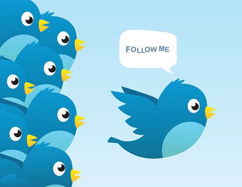
Grab new customers with a smartly designed call to action button. Optimize your CTA buttons today with a few simple tweaks.

Having an engaging social media post isn’t always enough to create conversions. Many businesses are dumping loads of cash into the creative aspects of their ads, but fail to see a spike in clicks. One problem area for your social media ads could be your call to action or CTA. The following are strategies to stop your ads from being passed by without a click from social media users.
Rely on Verbs
Don’t be afraid to issue out commands when creating clickable CTA buttons. In fact, research has shown adding in words such as “like,” “share,” “retweet,” and “comment” on your social media posts are more likely to produce the desired results. Make your CTA simple with actionable phrases. Examples could include “Download my book now,” “Explore more here,” and “Click here to join my team.” Don’t try to be witty or cute with your CTA language. You don’t want browsers to feel confused and not click the CTA button. Infuse the CTA with high energy. Sprinkle with phrases such as “sign up now” and “join today.”
Reduce Options
Presenting too many CTA options is a fatal flaw. You want to keep things as simple as possible to get the clicks you need for a successful campaign. If you give potential customers too many options to choose from, they may get confused and decide not to click on the provided links.
Create Urgency
You want to give prospective customers the sense that if they don’t act now, they’ll miss out on a once in a lifetime deal. Consider using language that provokes an instant click. For instance, your post could read “Last Chance Sale” or “Final Deal Days.” Urgency can also be created in other manners besides language. You can use exclamation points or bold text to create a similar effect.
Decide on a Hook
Before designing any call to action button, you have to slip into the head of your prospective customer. Your customers’ biggest question is likely to be “what’s in it for me?” Many people on social media aren’t always looking to buy, so you need to consider how to hook them without an initial commitment from them. A call to action button for a giveaway or freebie will earn you more clicks than buy links. Don’t trick readers with giveaway or freebie promises to just get clicks. Your landing page should match up to the promises given in the social media CTA.
Multiple CTA Options
Don’t limit yourself with only one CTA within a social media post. Make it even simpler by including multiple clickable links within an ad. For instance, share buttons could be added to both the top and bottom of a post. Call to action buttons can even be placed directly on an image. Since social media is image driven, it makes sense to put a CTA inside photos included with your posts. For instance, advertise a giveaway on Instagram by putting image text reading “Double Tap to Win Today!” Use header images as well to create clickable CTA buttons. Your graphics can encourage social media users to find and press the CTA button at the top of your profile page.
Look at Analytics
Comparing the clicks between social media ads provide you with insight into what calls to actions are working for your marketing campaign. Once you find out what CTA is performing better, you can make the necessary adjustments. For instance, if you change the CTA font color from green to red, you may end up seeing a spike in conversions. Remember to create different CTA buttons for each social media platform. Campaigns working on Facebook may not necessarily perform well on Twitter.
A Strong call to action buttons will create more meaningful engagements with your social media followers. Don’t be afraid to chuck what isn’t working and start over. A fresh new spin on a CTA could be just what you need to drive traffic to your website.

