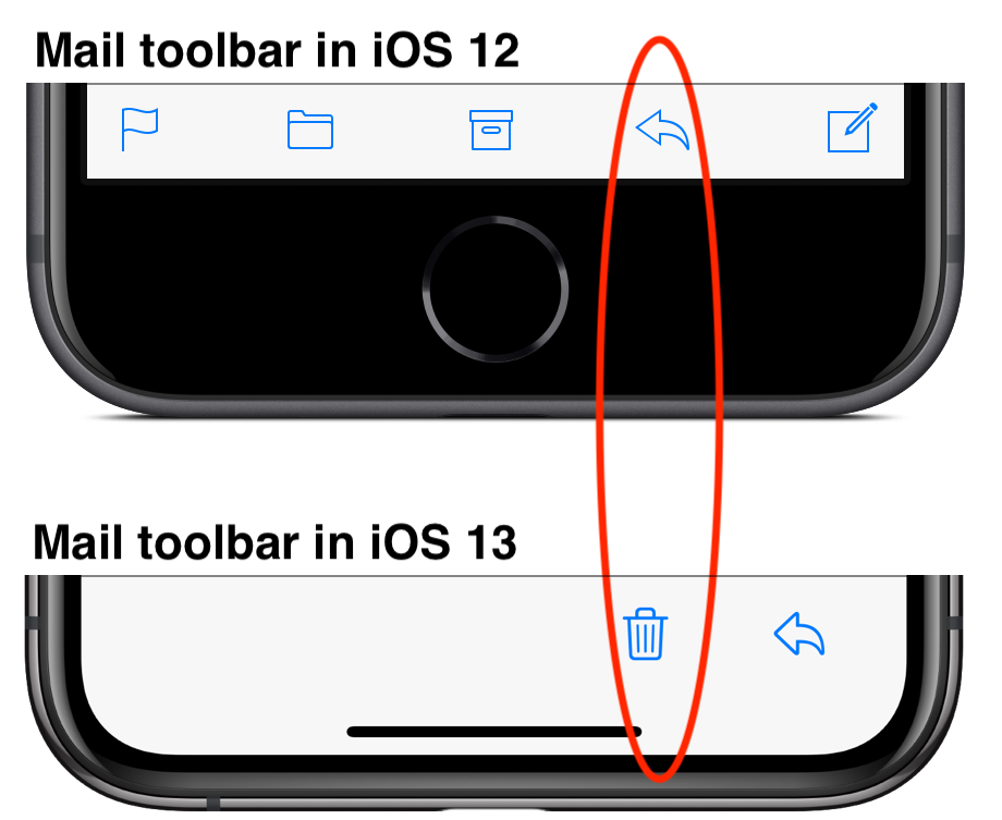
Be Careful in iOS 13’s Mail App—the Trash Button Is Where Reply Used to Be!
For unknown reasons, Apple redesigned the toolbar in the iOS 13 version of Mail. Such things happen, but this time, Apple made a big mistake and moved Mail’s Trash button to where its Reply button used to be. Lots of people who have become accustomed to tapping Reply are now finding themselves deleting messages inadvertently, since a tap in the same location in iOS 13 deletes the message. It’s hard to retrain muscle memory—the ability to reproduce a particular movement without conscious thought—but if you find yourself deleting messages accidentally, you’ll need to slow down and remember to tap the new location of the Reply button.

(Featured image by Skitterphoto from Pexels)
More tips to make the most of your iOS devices.
- iPhone Not Charging Reliably? Clean Its Lightning Port with a Toothpick
- Did You Know You Can Drag the Scroll Bar in iOS 13?
- Some of Our Favorite Features of iOS 13 and iPadOS 13
- The Fastest Way to Change Wi-Fi Networks in iOS 13
- Everything you need to know about Multi-Tasking in iPadOS 13


